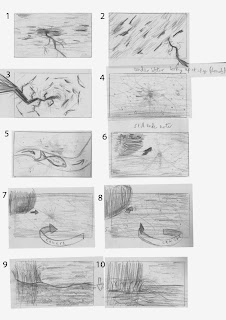
Starting with boards 1 to 3, my idea starts off by showing the sky with lightning flashing. This is just for the first two to three seconds. Although rather than just showing a few interesting camera angles, actually shake the camera and disorientate the viewer with quick blurry snippets. I thought that might go with the first sound played in the music.
4 to 10 are underwater. First a fish swims by, pauses and swims off camera. The black splodge in the distance is supposed to be the underside of the boat. The camera comes up close to the side of the boat and twists round to face the same direction as the boat. The camera is also rising and comes out of the water.
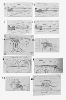
11 to 14 I hope is self explanatory. There is the sea, the sky, the boat and the horizon line dividing it in two. Three more sparks of lightning in the distance. This is timed to three sounds in the music. I was thinking of having it transition to 15 on the last flash. Notice in the reflection of the binoculars, you can see the the sea and sky with the horizon line in the same position.
16 shows the shadowy captain.
17 shows what he is seeing in the binoculars but they are also pulled down to see a wider angle of what's in front and then cuts back to the captain. He's seen a big wave coming his way.
In shot 20, the camera is following the wave, racing forwards, camera tilting from side to side a bit. Again this is timed to the music. 25 seconds in.
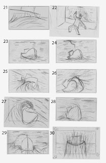
Bam... the wave hits the side of the boat in shot 21.
tssss… water comes up the side of the boat in shot 22.
23 to 28 show the boat getting battered by the waves. The camera is also tilting from side to side. In that sense, the viewer is also battling the waves.
29 to 32 show the camera panning around into the front of the boat and around to the other side, during another big splash. This is starting around 37 seconds in.
Now. There is a fish jumping in or over the boat. It may seem a bit randomly thrown in. No pun intended. But I pictured this fish in amongst the chaos, flapping about. Again this is one of those sounds I heard in the music. Its just a small background sound. The volume needs to be at a decent level to hear it. The fish can go if nobody likes it, or thinks it doesn't fit in.
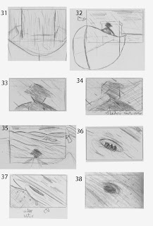
33 to 34 is continuing from the previous shot. The camera has just moved closer to the captain. A giant shadow is cast over him and the boat.
35 shows him looking at this giant wall of water.
36 he's in a whirl pool. Well something is sucking him into the sea. who knows what.
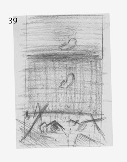
Then the camera plunges into the water. 38 shows the boat from under water.
Then the camera pans down, revealing many other ships and boats that have sunk.
Sorry thats a bit of a long read. I like to be certain that they're interpreted correctly.
It would probably be much clearer in an animatic. I'll try to get that done and uploaded asap.
I'm thinking of this as being a teaser trailer. So it's like a mini film for a bigger film which probably wont ever be made. I haven't yet decided on the title of the film, but whatever it is, it will be at the end of the animation not at the beggining. Like a real teaser trailer.
So there we have it. It is only the first storyboard and am open to suggestions. Of course if there's nothing wrong with it then it may as well be the final storyboard.
Whether there will be enough time to to Finnish the project, I don't know. One thing I do know is I haven't the foggiest idea how I'm going to make it. Stylisation (as mentioned previously) may be the way to simplify or alter some the technical challenges.

Bring it on, Ethan! :-0 :-) :-D Go, go, go! Really like the boards, but yes, get them into animatic form + music so we can see exactly how it's going to play out. Very impressed though - it feels very filmic, and you demonstrate a real sensitivity for editing and the shot-to-shot relationships. Excited! You should definitely try knocking out some stylisation tests too - make limitation your sophistication!
ReplyDeleteFantastic storyboarding Ethan! - and clearly explained too... I'm with Phil, and think you should do the animatic, as then you will get a real feel for how the music sits alongside the action. Keep going :)
ReplyDelete