I've finished the miniature scale space pod! Mostly. Just so everyone else knows, the CG pod is supposed to be a cheap miniature scale pod. Meaning that the parts won't necessarily line up and blobs of excess glue are visible!
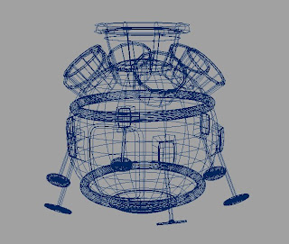
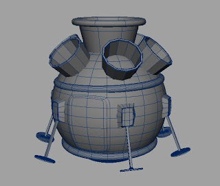
Now you may be looking at this and thinking, the door is fused to the sphere, or the legs don't look like they can move and they're not even touching the ground properly. Well Like I've said earlier. It's a miniature, which means, no moving parts. The legs can either be stuck on or not at all. The door only needs to open when the space men come out and funnily enough, they are CG actors, not miniatures. So they require a more detailed life size set to walk out of.
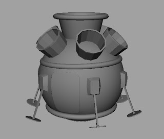
Excess glue!
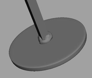
Oh and as a bonus, it's all been UV mapped! I bet Ruben will be pleased to here he's got more painting to do! Well I say UV mapped, but what I actually mean that it's unfolded, and all that's left to do is sort out the positioning and scale so it fits with a square. Then it can be textured.
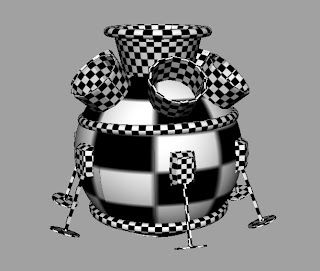
Although before I hand over that job, I want to add a few last minute touches to the basic model. Like shifting some of the individual pieces further, to increase it's inaccuracy. Maybe a few more blobs, or streaks of glue. Then the rest can be handled in the texture.

Okay, few pointers.
ReplyDeleteWireframe:
Try to give wireframes on a solid Lambert model. Turn on 'Use default materials' to do this easily. Turn off SubD (Press 1 on the keyboard for this) and turn on 'wireframe on shaded'.
UV's: Your biggest object in your model has the least amount of texture space. I can see this because of the massive checkerboard on that area and the small checker on the small parts. You have to think this through cleverly. For example : What parts are seen more, what parts are seen close to camera (storyboard should tell you these sorts of things) can I overlap certain aspects in order to save texture space? Your stands of the object go all the way around, you can't see both sides at once, so it's safe to say you can overlap the opposite sides. Most importantly, keep them in scale with the real objects. Right now you're going to have one big stretched texture on the main sphere, whilst the rest will have much more refined textures.
This comment has been removed by the author.
ReplyDeleteSorry, been a long day. :(
ReplyDeleteI suppose I over reacted. I think I better delete the comment.
Just thought I re post what I said. (but differently)
ReplyDeleteOK a slight oversight on my part, that I fogot to un smooth preview the geometry for the wireframe.
Also. Thanks for pointing out that the UVs look kind of unevenly allocated. Although technicaly the ball had maximum UV space. All the rest of the little objects (at the time) were outside of the UV space and far larger too. I just haddn't shrunk down them to fit in the square yet.
I apologise again for the way I reacted previously. :(
I'm not sure what was said here, the comment was gone before I could read it. Don't take what I say as a personal attack on yourself, i'm just offering up pointers for things that I wish people would have said to me when I was in your shoes.
ReplyDeleteDon't worry about the apology, we all snap back at people, I have many times. I'm sure Phil can back that up. Just remember, I've been there, and i've done it, I know what it feels like.
apology accepted. I love a happy ending :-)
ReplyDelete